Как заставить элемент <video>соответствовать всей высоте и ширине доступного экрана - PullRequest
0 голосов
/ 10 сентября 2018

У меня есть проект angular 6, я транслирую веб-камеру пользователя на элемент html.

По сути, я пытаюсь воспроизвести видео или фотографию на мобильном телефоне пользователя. Однако размер видео сейчас невелик. Я хотел бы подогнать его по всей доступной высоте / ширине, не искажая и не растягивая его, если это возможно.

.component.html

<div fxFlexFill fxLayout="column" class="videoContainer">
    <video #video autoplay></video>
</div>

<button class="lv-button gradient-theme" (click)="start()" [disabled]="started">Start</button>

.component.scss

video {
    border: 1px solid black;
    height: 80vh;
}

button {
    padding: 12px 25px;
    color: white;
    font-size: 15px;
    font-weight: 300;
    width: 100%;
}

enter image description here

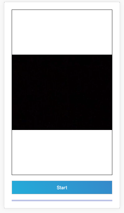
Сейчас он чёрный, потому что я закрыл камеру. Но я бы хотел, чтобы отображалась полная высота контейнера. Не растягивая его, я попытался использовать object-fit: cover, но это сокращает / увеличивает.

Ответы [ 2 ]

0 голосов
/ 10 сентября 2018

используйте object-fit здесь. Это решит вашу проблему.

.video {
    width: 100vw;
    height: 100vh;
    position: fixed;
    object-fit: cover;
}
0 голосов
/ 10 сентября 2018

отзывчивое видео в полноэкранном режиме

body {
  margin: 0;
  padding: 0;
  /*  Background fallback in case of IE8 & down, or in case video doens't load, such as with slower connections  */
  background: #333;
  background-attachment: fixed;
  background-size: cover;
}


/* The only rule that matters */

#video-background {
  /*  making the video fullscreen  */
  position: fixed;
  right: 0;
  bottom: 0;
  min-width: 100%;
  min-height: 100%;
  width: auto;
  height: auto;
  z-index: -100;
}


/* These just style the content */

article {
  /*  just a fancy border  */
  position: absolute;
  top: 0;
  left: 0;
  right: 0;
  bottom: 0;
  border: 10px solid rgba(255, 255, 255, 0.5);
  margin: 10px;
}

h1 {
  position: absolute;
  top: 60%;
  width: 100%;
  font-size: 36px;
  letter-spacing: 3px;
  color: #fff;
  font-family: Oswald, sans-serif;
  text-align: center;
}

h1 span {
  font-family: sans-serif;
  letter-spacing: 0;
  font-weight: 300;
  font-size: 16px;
  line-height: 24px;
}

h1 span a {
  color: #fff;
}
<link href='https://fonts.googleapis.com/css?family=Oswald' rel='stylesheet' type='text/css'>

<!--  Content  -->
<article>
  <h1>Responsive Video Background</h1>
</article>

<!--  Video is muted & autoplays, placed after major DOM elements for performance & has an image fallback  -->
<video autoplay loop id="video-background" muted plays-inline>
  <source src="https://player.vimeo.com/external/158148793.hd.mp4?s=8e8741dbee251d5c35a759718d4b0976fbf38b6f&profile_id=119&oauth2_token_id=57447761" type="video/mp4">
</video>
...