CSS / SCSS Пользовательский эффект подсказки - PullRequest
0 голосов
/ 05 февраля 2019

Привет, ребята. Я пытаюсь создать собственную подсказку с классным эффектом зависания.Я нашел код в Интернете, который делает почти то, что я хочу.Ниже приведен код

.tooltip {
  position: relative;

  &__item {
    position: absolute;
    min-width: 100px;
    padding: 20px;
    visibility: hidden;
    opacity: 0;
    background: white;
    transition: all .250s cubic-bezier(0, 0, 0.2, 1);
    color: #484848;
    border: 1px solid #cecece;
    border-radius: 3px;
    font-weight: 500;
    box-shadow: 0 2px 1px #bcbcbc;
    z-index: 4;
    &:after {
      content: "";
      display: block;
      position: absolute;
      width: 0;
      height: 0;
      border-style: solid;
    }
  }

  &__initiator {
    cursor: pointer;
    z-index: 5;
  }

  &[data-direction="bottom"] {

    .tooltip__initiator:hover ~ .tooltip__item {
      transform: translate3d(-50%, 0, 0);
      visibility: visible;
      opacity: 1;
    }

    .tooltip__item {
      top: calc(100% + 1em);
      left: 50%; 
      transform: translate3d(-50%, -15px, 0);

      &:after {
        top: -0.5em;
        left: 50%;
        transform: translate3d(-50%, 0, 0);
        border-width: 0 0.5em 0.5em 0.5em;
        border-color: transparent transparent white transparent;
        -webkit-filter: drop-shadow(1px 2px 1px #bcbcbc);
        filter: drop-shadow(1px -1px 1px #bcbcbc);
      }
    }
  }
}

, а вот результат Tool tip result

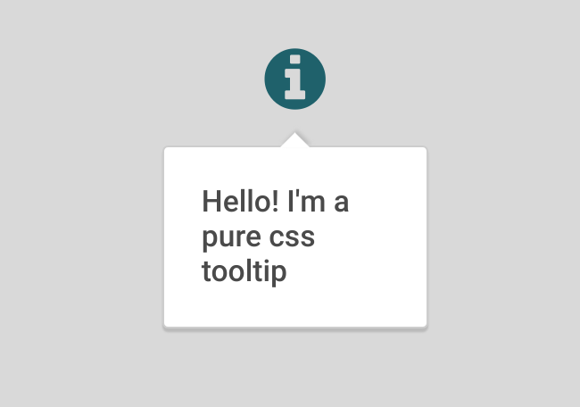
Я хочу, чтобы пользовательская подсказка отображалась над компонентом. НЕ ниже .Я новичок в css / scss, так может ли добрый человек отредактировать код для меня, чтобы получить этот эффект?

ОБНОВЛЕНИЕ
Эта ссылка , откуда я получил код.У него есть рабочий пример.

Ответы [ 3 ]

0 голосов
/ 05 февраля 2019

Я бы добавил "top" data-directio.Вам необходимо изменить местоположение всплывающей подсказки, изменив значение top.Также вам нужно изменить направление и расположение маленькой стрелки, изменив :after

 top -> bottom

и цвета рамки

border-color: white transparent white transparent;

и тени:

filter: drop-shadow(-1px 1px 1px #bcbcbc);

Вот полный код:

&[data-direction="top"] {
    .tooltip__initiator:hover ~ .tooltip__item {
      transform: translate3d(-50%, 0, 0);
      visibility: visible;
      opacity: 1;
    }

    .tooltip__item {
      top: calc(-200% - 2em);
      left: 50%; 
      transform: translate3d(-50%, -15px, 0);

      &:after {
        bottom: -0.5em;
        left: 50%;
        transform: translate3d(-50%, 0, 0);
        border-width: 0.5em 0.5em 0 0.5em;
        border-color: white transparent white transparent;
        -webkit-filter: drop-shadow(1px 2px 1px #bcbcbc);
        filter: drop-shadow(-1px 1px 1px #bcbcbc);
      }
    }
  }

И пример здесь

0 голосов
/ 05 февраля 2019

.tooltip {
  position: relative;
}
.tooltip__item {
  position: absolute;
  min-width: 100px;
  padding: 20px;
  visibility: hidden;
  opacity: 0;
  background: white;
  transition: all 0.25s cubic-bezier(0, 0, 0.2, 1);
  color: #484848;
  border: 1px solid #cecece;
  border-radius: 3px;
  font-weight: 500;
  box-shadow: 0 2px 1px #bcbcbc;
  z-index: 4;
}
.tooltip__item:after {
  content: "";
  display: block;
  position: absolute;
  width: 0;
  height: 0;
  border-style: solid;
}
.tooltip__initiator {
  cursor: pointer;
  z-index: 5;
}
.tooltip[data-direction="left"] .tooltip__initiator:hover ~ .tooltip__item {
  transform: translate3d(0, -50%, 0);
  visibility: visible;
  opacity: 1;
}
.tooltip[data-direction="left"] .tooltip__item {
  top: 50%;
  right: calc(100% + 1em);
  transform: translate3d(15px, -50%, 0);
}
.tooltip[data-direction="left"] .tooltip__item:after {
  top: 50%;
  right: -0.5em;
  transform: translate3d(0, -50%, 0);
  border-width: 0.5em 0 0.5em 0.5em;
  border-color: transparent transparent transparent white;
  -webkit-filter: drop-shadow(0px 2px 1px #bcbcbc);
  filter: drop-shadow(0px 2px 1px #bcbcbc);
}
.tooltip[data-direction="top"] .tooltip__initiator:hover ~ .tooltip__item, .tooltip[data-direction="bottom"] .tooltip__initiator:hover ~ .tooltip__item {
  transform: translate3d(-50%, 0, 0);
  visibility: visible;
  opacity: 1;
}
.tooltip[data-direction="top"] .tooltip__item, .tooltip[data-direction="bottom"] .tooltip__item {
  left: 50%;
  transform: translate3d(-50%, -15px, 0);
}
.tooltip[data-direction="top"] .tooltip__item:after, .tooltip[data-direction="bottom"] .tooltip__item:after {
  left: 50%;
  transform: translate3d(-50%, 0, 0);
}
.tooltip[data-direction="top"] .tooltip__item {
  bottom: calc(100% + 1em);
}
.tooltip[data-direction="top"] .tooltip__item:after {
  bottom: -0.5em;
  border-width: 0.5em 0.5em 0 0.5em;
  border-color: white transparent transparent transparent;
  filter: drop-shadow(0px 2px 1px #bcbcbc);
  -webkit-filter: drop-shadow(0px 2px 1px #bcbcbc);
}
.tooltip[data-direction="bottom"] .tooltip__item {
  top: calc(100% + 1em);
}
.tooltip[data-direction="bottom"] .tooltip__item:after {
  top: -0.5em;
  border-width: 0 0.5em 0.5em 0.5em;
  border-color: transparent transparent white transparent;
  filter: drop-shadow(0px -1px 1px #bcbcbc);
  -webkit-filter: drop-shadow(0px -1px 1px #bcbcbc);
}

.fa.fa-info-circle {
  font-size: 38px;
  color: #21606b;
}

body {
  margin: 0;
  min-height: 100vh;
  display: flex;
  flex-direction: column;
  font-family: sans-serif;
  background: #dadada;
  font-family: 'Roboto', sans-serif;
}

main {
  flex: 1 1 100vh;
  min-height: 100vh;
  display: flex;
  flex-direction: row;
  align-items: center;
  justify-content: space-around;
}
<link href="https://maxcdn.bootstrapcdn.com/font-awesome/4.7.0/css/font-awesome.min.css" rel="stylesheet" integrity="sha384-wvfXpqpZZVQGK6TAh5PVlGOfQNHSoD2xbE+QkPxCAFlNEevoEH3Sl0sibVcOQVnN" crossorigin="anonymous">
<link href="https://fonts.googleapis.com/css?family=Roboto:300,400,500,700" rel="stylesheet">
<main>
  
  <!-- tooltip block -->
  <div class="tooltip" data-direction="top">
    <div class="tooltip__initiator">
      <!-- element with tooltip hover call -->
      <i class="fa fa-info-circle"></i>
    </div>
    <div class="tooltip__item">
      Hello! I'm a pure css tooltip going up
    </div>
  </div>
  
  <!-- tooltip block -->
  <div class="tooltip" data-direction="bottom">
    <div class="tooltip__initiator">
      <!-- element with tooltip hover call -->
      <i class="fa fa-info-circle"></i>
    </div>
    <div class="tooltip__item">
      Hello! I'm a pure css tooltip going down
    </div>
  </div>
  
  
</main>
0 голосов
/ 05 февраля 2019

Готово.

Скопируйте и вставьте этот CSS

   &[data-direction="bottom"] {

    .tooltip__initiator:hover ~ .tooltip__item {
      transform: translate3d(-50%, 0, 0);
      visibility: visible;
      opacity: 1;
    }

    .tooltip__item {
      bottom: 50px;
      left: 50%; 
      transform: translate3d(-50%, -15px, 0);

      &:after {
        top: 100%;
        left: 45%;
        transform: translate3d(-40%, 0, 0);
        border-width: 0 0.5em 0.5em 0.5em;
        border-color: transparent transparent white transparent;
        transform:rotate(180deg);
        -webkit-filter: drop-shadow(1px 2px 1px #bcbcbc);
        filter: drop-shadow(1px -1px 1px #bcbcbc);
      }
    }
  }
Добро пожаловать на сайт PullRequest, где вы можете задавать вопросы и получать ответы от других членов сообщества.
...