Как добавить слайд-анимацию и слайд-слайд в переменную высоту div? - PullRequest
0 голосов
/ 12 июня 2018

Я хочу добавить анимацию скольжения вверх и вниз при наведении курсора на карту Div.
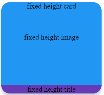
Начальная карта:

enter image description here

При наведении курсора на карту:

желтая часть должна скользящий вверх и когда я снимаю парение, он должен скользить вниз , пока он не будет виден.enter image description here

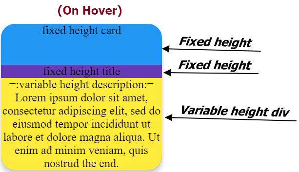
Я могу показать и скрыть желтую часть при наведении, но не могу оживить .Я думаю, из-за top: 182px; bottom: auto; (используйте, чтобы скрыть желтую часть и расположить фиолетовую часть внизу) и top:auto;bottom:0; (чтобы полностью показать желтую карточку независимо от ее высоты)

Вот код:

.card{
  margin-right:20px;
display: inline-block;
    padding: 0;
    border-radius: 19px;
    box-shadow: 0 6px 10px 0 rgba(0, 0, 0, 0.2);
    overflow: hidden;
    height: 200px;
    background-color:#2196f3;
    position:relative;
    text-align:center;
}
.image{
  padding:50px;
}
.content{
  border-radius: 0 0 19px 19px;
        background-color: #673AB7;
    position: absolute;
    width: 100%;
    top: 182px;
    bottom: auto;
}
.desc{
  background-color:#ffeb3b;
}

.card:hover .content{
  top: auto;
    transition: all 2s ease;
    bottom: 0px;
}
<div class='card'>
    fixed height card
    <div class='image'>
        fixed height image
    </div>
    <div class='content'>
        <div class='title'>
            fixed height title
        </div>
        <div class='desc'>
            =:variable height description:= Lorem ipsum dolor sit amet, consectetur adipiscing elit, sed do eiusmod tempor incididunt ut
            labore et dolore magna aliqua. Ut enim ad minim veniam, quis nostrud the end.
        </div>
    </div>
</div>

<div class='card'>
    fixed height card
    <div class='image'>
        fixed height image
    </div>
    <div class='content'>
        <div class='title'>
            fixed height title
        </div>
        <div class='desc'>
            =:variable height description:= Lorem ipsum dolor sit amet, consectecing elit, sed do eiusmod tempor incididunt ut the end.
        </div>
    </div>
</div>

Вот JSFiddle для игры: http://jsfiddle.net/JerryGoyal/63c8hbr5/

Я открыт для идей, если это можно сделать только с помощью CSS!

Ответы [ 3 ]

0 голосов
/ 12 июня 2018

Изменен переход на работу на desc div вместо content.Также переходы не работают для свойства auto.Попробуйте использовать свойство max-height, как я показал.Максимальная высота должна быть очень большой высоты, которую может получить ваш div.

Обновлен CSS

.card {
      margin-right: 20px;
      display: inline-block;
      padding: 0;
      border-radius: 19px;
      box-shadow: 0 6px 10px 0 rgba(0, 0, 0, 0.2);
      overflow: hidden;
      height: 200px;
      background-color: #2196f3;
      position: relative;
      text-align: center;
    }

    .image {
      padding: 50px;
    }

    .content {
      border-radius: 0 0 19px 19px;
      background-color: #673AB7;
      position: absolute;
      width: 100%;
      bottom: 0;
    }

    .desc {
      background-color: #ffeb3b;
      max-height: 0;
      transition: all 2s ease;
    }

    .card:hover .desc {
      max-height: 500px;
    }

.card {
  margin-right: 20px;
  display: inline-block;
  padding: 0;
  border-radius: 19px;
  box-shadow: 0 6px 10px 0 rgba(0, 0, 0, 0.2);
  overflow: hidden;
  height: 200px;
  background-color: #2196f3;
  position: relative;
  text-align: center;
}

.image {
  padding: 50px;
}

.content {
  border-radius: 0 0 19px 19px;
  background-color: #673AB7;
  position: absolute;
  width: 100%;
  bottom: 0;
}

.desc {
  background-color: #ffeb3b;
  max-height: 0;
  transition: all 2s ease;
}

.card:hover .desc {
  max-height: 500px;
}
<div class='card'>
  fixed height card
  <div class='image'>
    fixed height image
  </div>
  <div class='content'>
    <div class='title'>
      fixed height title
    </div>
    <div class='desc'>
      =:variable height description:= Lorem ipsum dolor sit amet, consectetur adipiscing elit, sed do eiusmod tempor incididunt ut labore et dolore magna aliqua. Ut enim ad minim veniam, quis nostrud the end.
    </div>
  </div>
</div>

<div class='card'>
  fixed height card
  <div class='image'>
    fixed height image
  </div>
  <div class='content'>
    <div class='title'>
      fixed height title
    </div>
    <div class='desc'>
      =:variable height description:= Lorem ipsum dolor sit amet, consectecing elit, sed do eiusmod tempor incididunt ut the end.
    </div>
  </div>
</div>
0 голосов
/ 12 июня 2018

Вы правы в том, что вам нужно всегда использовать одну и ту же технику положения.

Вам нужно придерживаться дна, а затем установить перевод Y

.card {
  margin-right: 20px;
  display: inline-block;
  padding: 0;
  border-radius: 19px;
  box-shadow: 0 6px 10px 0 rgba(0, 0, 0, 0.2);
  overflow: hidden;
  height: 200px;
  background-color: #2196f3;
  position: relative;
  text-align: center;
}

.image {
  padding: 50px;
}

.content {
  border-radius: 0 0 19px 19px;
  background-color: #673AB7;
  position: absolute;
  width: 100%;
  bottom: 18px;
  transform: translateY(100%);
  transition: all 2s ease;
}

.desc {
  background-color: #ffeb3b;
}

.card:hover .content {
  bottom: 0px;
  transform: translateY(0%);
}
<div class='card'>
  fixed height card
  <div class='image'>
    fixed height image
  </div>
  <div class='content'>
    <div class='title'>
      fixed height title
    </div>
    <div class='desc'>
      =:variable height description:= Lorem ipsum dolor sit amet, consectetur adipiscing elit, sed do eiusmod tempor incididunt ut labore et dolore magna aliqua. Ut enim ad minim veniam, quis nostrud the end.
    </div>
  </div>
</div>

<div class='card'>
  fixed height card
  <div class='image'>
    fixed height image
  </div>
  <div class='content'>
    <div class='title'>
      fixed height title
    </div>
    <div class='desc'>
      =:variable height description:= Lorem ipsum dolor sit amet, consectecing elit, sed do eiusmod tempor incididunt ut the end.
    </div>
  </div>
</div>
0 голосов
/ 12 июня 2018

Вы можете использовать ключевые кадры для добавления анимации к вашему наведенному контенту.

.card{
  margin-right:20px;
display: inline-block;
    padding: 0;
    border-radius: 19px;
    box-shadow: 0 6px 10px 0 rgba(0, 0, 0, 0.2);
    overflow: hidden;
    height: 200px;
    background-color:#2196f3;
    position:relative;
    text-align:center;
}
.image{
  padding:50px;
}
    .content{
  border-radius: 0 0 19px 19px;
        background-color: #673AB7;
    position: absolute;
    width: 100%;
    top: 182px;
    bottom: auto;
    animation-name: slideFromTop;
        -webkit-animation-name: slideFromTop;
        animation-duration: 800ms;
        -webkit-animation-duration: 800ms;
        animation-timing-function: ease-out;
        -webkit-animation-timing-function: ease-out;
        animation-fill-mode: forwards;
        -webkit-animation-fill-mode: forwards;
}
.desc{
  background-color:#ffeb3b;
}

.card:hover .content{
  top: auto;
    bottom: 0px;
    animation-name: slideFromBottom;
        -webkit-animation-name: slideFromBottom;
        animation-duration: 800ms;
        -webkit-animation-duration: 800ms;
        animation-timing-function: ease-in;
        -webkit-animation-timing-function: ease-in;
        animation-fill-mode: forwards;
        -webkit-animation-fill-mode: forwards;
  
}


@keyframes slideFromBottom  {
        0%{
            opacity:0;
            -webkit-transform: translateY(100%);
            -moz-transform: translateY(100%);
            -ms-transform: translateY(100%);
            -o-transform: translateY(100%);
            transform: translateY(100%);
        }
        100%{
            opacity: 1;
            -webkit-transform: translateY(0px);
            -moz-transform: translateY(0px);
            -ms-transform: translateY(0px);
            -o-transform: translateY(0px);
            transform: translateY(0px);
            display: block;
        }
    }
@keyframes slideFromTop  {
    0%{
        opacity:1;
        -webkit-transform: translateY(0px);
        -moz-transform: translateY(0px);
        -ms-transform: translateY(0px);
        -o-transform: translateY(0px);
        transform: translateY(0px);
    }
    100%{
        opacity: 0;
        -webkit-transform: translateY(100%);
        -moz-transform: translateY(100%);
        -ms-transform: translateY(400%);
        -o-transform: translateY(100%);
        transform: translateY(100%);
    }
}
<div class='card'>
    fixed height card
    <div class='image'>
        fixed height image
    </div>
    <div class='content'>
        <div class='title'>
            fixed height title
        </div>
        <div class='desc'>
            =:variable height description:= Lorem ipsum dolor sit amet, consectetur adipiscing elit, sed do eiusmod tempor incididunt ut
            labore et dolore magna aliqua. Ut enim ad minim veniam, quis nostrud the end.
        </div>
    </div>
</div>

<div class='card'>
    fixed height card
    <div class='image'>
        fixed height image
    </div>
    <div class='content'>
        <div class='title'>
            fixed height title
        </div>
        <div class='desc'>
            =:variable height description:= Lorem ipsum dolor sit amet, consectecing elit, sed do eiusmod tempor incididunt ut the end.
        </div>
    </div>
</div>

Вы можете проверить эту ссылку для JSFiddle

Надеюсь, что это поможет вам!

Ура!

Добро пожаловать на сайт PullRequest, где вы можете задавать вопросы и получать ответы от других членов сообщества.
...