IDataErrorInfo переопределил стилизацию ошибок в списках - PullRequest
0 голосов
/ 15 декабря 2018

У меня есть поле со списком, который проверяет ошибки данных.Когда в поле со списком обнаружена ошибка, я хочу, чтобы фон стал красным, а когда пользователь наводит курсор на него, отображается всплывающая подсказка.До сих пор я пытался добавить

<Trigger Property="Validation.HasError" Value="True">
                            <Setter Property="Background" Value="Red" />
                            <Setter Property="ToolTip" Value="{Binding RelativeSource={x:Static RelativeSource.Self}, Path=(Validation.Errors)[0].ErrorContent}" />
                        </Trigger>

, что приводит к тому, что по умолчанию используется красный контур и отображается всплывающая подсказка об ошибке.

combo box error

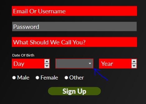
, как видно на скриншоте выше, другие текстовые поля имеют красный фон при возникновении ошибки, но поле со списком все еще имеет контур по умолчанию.

 <!-- Month combo box styling with attempt at adding error trigger removed-->
    <Style x:Key="MonthComboBoxDropDown" TargetType="{x:Type ComboBox}" >
        <Setter Property="Foreground" Value="{StaticResource WhiteColorBrush}" />
        <Setter Property="FontSize" Value="{StaticResource FontSize20}" />
        <Setter Property="FontFamily" Value="{StaticResource LatoRegular}" />
        <Setter Property="Template">
            <Setter.Value>
                <ControlTemplate TargetType="ComboBox">
                    <Grid>
                        <ToggleButton Grid.Column="2" Focusable="false" IsChecked="{Binding Path=IsDropDownOpen,Mode=TwoWay,RelativeSource={RelativeSource TemplatedParent}}" >
                            <ToggleButton.Template>
                                <ControlTemplate>
                                    <Grid>
                                        <Grid.ColumnDefinitions>
                                            <ColumnDefinition Width="5*" />
                                            <ColumnDefinition Width="*" />
                                        </Grid.ColumnDefinitions>

                                        <Border x:Name="Border" Background="{StaticResource DarkGreyBrush}" Grid.ColumnSpan="2" BorderThickness="0" />
                                        <Path x:Name="Arrow" Grid.Column="1"  Fill="{StaticResource WhiteColorBrush}" HorizontalAlignment="Center" VerticalAlignment="Center" Data="M 0 0 L 4 4 L 8 0 Z"/>

                                    </Grid>
                                    <ControlTemplate.Triggers>
                                        <Trigger Property="ToggleButton.IsMouseOver" Value="true">
                                            <Setter TargetName="Border" Property="Background" Value="{StaticResource LightGreyBrush}" />
                                        </Trigger>
                                        <Trigger Property="ToggleButton.IsChecked" Value="true">
                                            <Setter TargetName="Border" Property="Background" Value="{StaticResource LightGreyBrush}" />
                                        </Trigger>
                                    </ControlTemplate.Triggers>
                                </ControlTemplate>
                            </ToggleButton.Template>
                        </ToggleButton>
                        <ContentPresenter Name="ContentSite" IsHitTestVisible="False"  Content="{TemplateBinding SelectionBoxItem}" ContentTemplate="{TemplateBinding SelectionBoxItemTemplate}" ContentTemplateSelector="{TemplateBinding ItemTemplateSelector}" Margin="3" />
                        <TextBox x:Name="PART_EditableTextBox" Visibility="Hidden" MinWidth="120" />
                        <Popup Name="Popup" Placement="Bottom" IsOpen="{TemplateBinding IsDropDownOpen}" AllowsTransparency="True"  Focusable="False" PopupAnimation="Slide">
                            <Grid  Name="DropDown" SnapsToDevicePixels="True" MinWidth="{TemplateBinding ActualWidth}" MaxHeight="{TemplateBinding MaxDropDownHeight}">
                                <Border x:Name="DropDownBorder" Background="{StaticResource DarkGreyBrush}" />
                                <ScrollViewer SnapsToDevicePixels="True" Foreground="{StaticResource WhiteColorBrush}" FontFamily="{StaticResource LatoRegular}" FontSize="{StaticResource FontSize20}" VerticalAlignment="Center">
                                    <StackPanel IsItemsHost="True" />
                                </ScrollViewer>
                            </Grid>
                        </Popup>
                    </Grid>
                </ControlTemplate>
            </Setter.Value>
        </Setter>
    </Style>

Может кто-нибудь сказать мне, что я делаю неправильно?

1 Ответ

0 голосов
/ 17 декабря 2018

Border в вашем ControlTemplate всегда использует DarkGreyBrush в качестве Background для Border элемента.Вместо этого используйте TemplateBinding:

<Style x:Key="MonthComboBoxDropDown" TargetType="{x:Type ComboBox}" >
    <Setter Property="Background" Value="{StaticResource DarkGreyBrush}" />
    <Setter Property="Foreground" Value="{StaticResource WhiteColorBrush}" />
    <Setter Property="FontSize" Value="{StaticResource FontSize20}" />
    <Setter Property="FontFamily" Value="{StaticResource LatoRegular}" />
    <Setter Property="Template">
        <Setter.Value>
            <ControlTemplate TargetType="ComboBox">
                <Grid>
                    <ToggleButton Grid.Column="2" Focusable="false" IsChecked="{Binding Path=IsDropDownOpen,Mode=TwoWay,RelativeSource={RelativeSource TemplatedParent}}" >
                        <ToggleButton.Template>
                            <ControlTemplate>
                                <Grid>
                                    <Grid.ColumnDefinitions>
                                        <ColumnDefinition Width="5*" />
                                        <ColumnDefinition Width="*" />
                                    </Grid.ColumnDefinitions>

                                    <Border x:Name="Border" Background="{TemplateBinding Background}" Grid.ColumnSpan="2" BorderThickness="0" />
                                    <Path x:Name="Arrow" Grid.Column="1"  Fill="{StaticResource WhiteColorBrush}" HorizontalAlignment="Center" VerticalAlignment="Center" Data="M 0 0 L 4 4 L 8 0 Z"/>

                                </Grid>
                                <ControlTemplate.Triggers>
                                    <Trigger Property="ToggleButton.IsMouseOver" Value="true">
                                        <Setter TargetName="Border" Property="Background" Value="{StaticResource LightGreyBrush}" />
                                    </Trigger>
                                    <Trigger Property="ToggleButton.IsChecked" Value="true">
                                        <Setter TargetName="Border" Property="Background" Value="{StaticResource LightGreyBrush}" />
                                    </Trigger>
                                </ControlTemplate.Triggers>
                            </ControlTemplate>
                        </ToggleButton.Template>
                    </ToggleButton>
                    <ContentPresenter Name="ContentSite" IsHitTestVisible="False"  Content="{TemplateBinding SelectionBoxItem}" ContentTemplate="{TemplateBinding SelectionBoxItemTemplate}" ContentTemplateSelector="{TemplateBinding ItemTemplateSelector}" Margin="3" />
                    <TextBox x:Name="PART_EditableTextBox" Visibility="Hidden" MinWidth="120" />
                    <Popup Name="Popup" Placement="Bottom" IsOpen="{TemplateBinding IsDropDownOpen}" AllowsTransparency="True"  Focusable="False" PopupAnimation="Slide">
                        <Grid  Name="DropDown" SnapsToDevicePixels="True" MinWidth="{TemplateBinding ActualWidth}" MaxHeight="{TemplateBinding MaxDropDownHeight}">
                            <Border x:Name="DropDownBorder" Background="{StaticResource DarkGreyBrush}" />
                            <ScrollViewer SnapsToDevicePixels="True" Foreground="{StaticResource WhiteColorBrush}" FontFamily="{StaticResource LatoRegular}" FontSize="{StaticResource FontSize20}" VerticalAlignment="Center">
                                <StackPanel IsItemsHost="True" />
                            </ScrollViewer>
                        </Grid>
                    </Popup>
                </Grid>
            </ControlTemplate>
        </Setter.Value>
    </Setter>
</Style>

Кстати, вы должны включить все ссылочные ресурсы, такие как, например, DarkGreyBrush и WhiteColorBrush при публикации Style.

...