Как настроить angular компонентов материала - PullRequest
0 голосов
/ 24 марта 2020

Я пытаюсь создать простую и гибкую форму регистрации, используя материал angular. Я попытался изменить высоту входа для больших экранов, чтобы он был более заметным, и все сломалось.

  • Я не могу выровнять mat-icon и mat-label в центре
  • Эффект ряби для кнопки mat-icon не выровнен
  • Я не могу изменить размер шрифта кнопки, пока эта кнопка имеет атрибут mat-raised-button

Как настроить эти элементы? Я не могу найти ничего в angular документациях по материалам, и в этот момент мне хочется сделать все с нуля без angular материала и его причудливых вещей. Но, возможно, я не прошел через их сайт так тщательно, как следовало бы. Я пробовал самые очевидные вещи, такие как: font-size, используя flexbox, vertical-align, но ни одна из них не работала для меня. HTML

<mat-form-field appearance="outline" class="form-field">
  <mat-label>Password</mat-label>
  <mat-icon matPrefix>lock_outline</mat-icon>
  <input
    matInput
    formControlName="password"
    [errorStateMatcher]="semiStrictMatcher"
    [type]="hide ? 'password' : 'text'"
  />
  <button
    mat-icon-button
    matSuffix
    (click)="hide = !hide"
    [attr.aria-label]="'Hide password'"
    [attr.aria-pressed]="hide"
    type="button"
  >
    <mat-icon>{{ hide ? "visibility_off" : "visibility" }}</mat-icon>
  </button>

CSS:

   @media screen and (min-width: 2500px) {
      .form-field {
        margin-bottom: 50px;
        height: 200px;
        font-size: 40px;
        mat-icon {
          margin-right: 20px;
        }
        input {
          height: 80px; //<- this is the culprit - everything misaligned after this
        }
        mat-icon,
        mat-label,
        input {
          font-size: 45px;
        }
      }
   }

Вот как это выглядит по умолчанию (меньшие экраны): small screens example - good

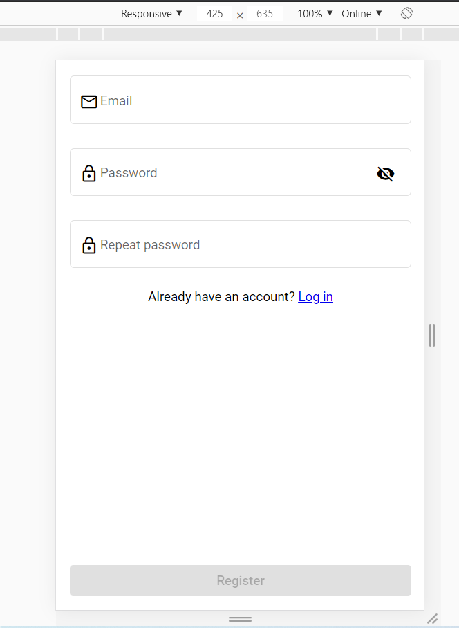
И вот что произошло после того, как я увеличил высоту ввода (большие экраны): large screens example - bad

1 Ответ

0 голосов
/ 24 марта 2020

Вы можете настроить mat-form-field, как показано ниже, внутри global styles.scss:

.custom-form-field {
  width: 600px;
  font-size: 40px;

  .mat-form-field-prefix {
    .mat-icon {
      font-size: 60px;
      width: 60px;
      height: 60px;
      line-height: 60px;
    }
    margin-right: 15px;
  }

  .mat-form-field-suffix {
    button {
      .mat-icon {
        font-size: 60px;
        width: 60px;
        height: 60px;
        line-height: 60px;
      }
      margin-left: 10px;
    }
  }
}

Если вы не хотите создавать глобальный стиль в styles.scss и хотите использовать компонент scss , вам нужно установить имя класса на matPrefix и matSuffix, чтобы правильно адресовать их:

в component.html`

<mat-form-field appearance="outline" class="custom-form-field">
    <mat-label>Password</mat-label>
    <mat-icon matPrefix class="prefix">lock_outline</mat-icon>

    <input matInput [type]="hide ? 'password' : 'text'" />

    <button mat-icon-button matSuffix class="suffix" (click)="hide = !hide">
      <mat-icon>{{ hide ? "visibility_off" : "visibility" }}</mat-icon>
    </button>

  </mat-form-field>

в component.scss:

.custom-form-field {
  width: 600px;
  font-size: 40px;

  .mat-icon.prefix {
    font-size: 60px;
    width: 60px;
    height: 60px;
    line-height: 60px;
    margin-right: 15px;
  }

  button.suffix {
    .mat-icon {
      font-size: 60px;
      width: 60px;
      height: 60px;
      line-height: 60px;
    }
    margin-left: 10px;
  }
}
...