У меня есть кнопка, у которой при наведении курсора появляется тень от окна.
Я не знаю , как сделать тень от рамки меньше по ширине.
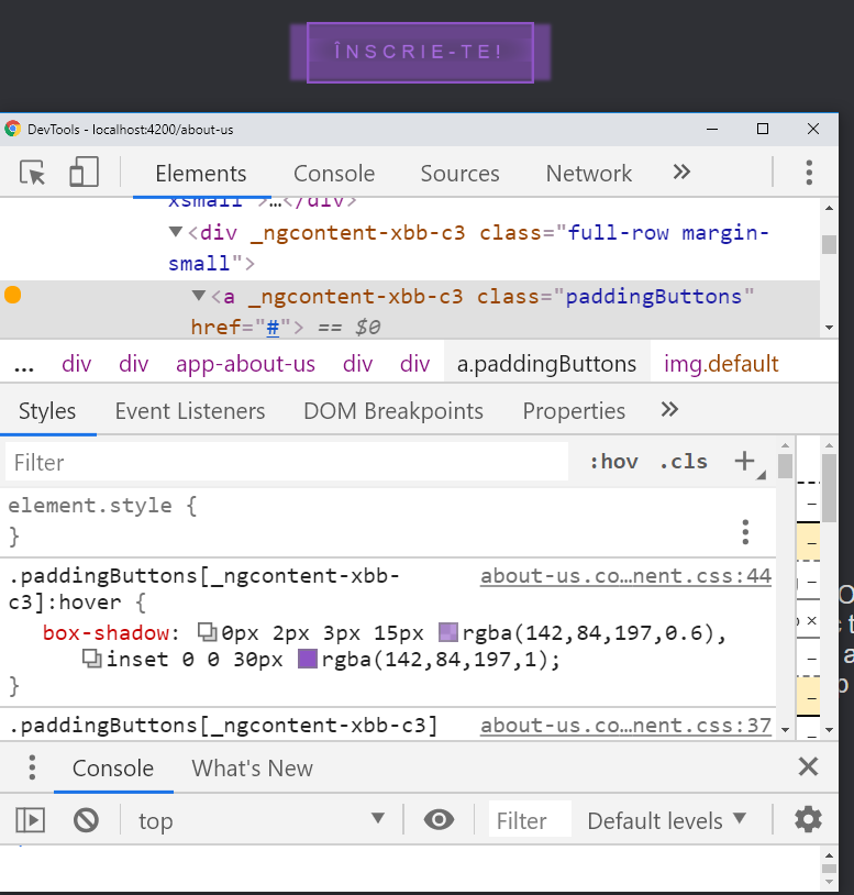
Я прикреплю текущее состояние моей кнопки:
Вот соответствующий код:
.paddingButtons {
  -webkit-transition: all 1s ease;
  -moz-transition: all 1s ease;
  -o-transition: all 1s ease;
  -ms-transition: all 1s ease;
  transition: all 1s ease;
}

.paddingButtons:hover {
  -webkit-box-shadow: 0px 2px 3px 15px rgba(142, 84, 197, 0.6), inset 0 0 30px rgba(142, 84, 197, 1);
  -moz-box-shadow: 0px 2px 3px 15px rgba(142, 84, 197, 0.6), inset 0 0 30px rgba(142, 84, 197, 1);
  box-shadow: 0px 2px 3px 15px rgba(142, 84, 197, 0.6), inset 0 0 30px rgba(142, 84, 197, 1);
}

.wrapper {
  display: grid;
  grid-template-columns: auto auto auto;
  grid-gap: 10px;
  padding: 10px;
  justify-items: center;
  text-align: center;
}

.full-row {
  grid-column: 1/4;
  text-align: center;
}
<div class="wrapper">
  <div class="full-row margin-small">
    <a href="#" class="paddingButtons">
      <img src="https://i.imgur.com/Ilwpsig.png" class="default" width=80% />
    </a>
  </div>
</div>