Я использую flexbox, чтобы сделать макет моего сайта, чтобы облегчить отзывчивость, но когда ширина экрана становится меньше 800px, строки оказываются друг над другом. Я пытаюсь решить это с помощью медиа-запросов, но не знаю точно, что здесь делать. Я пытался использовать flex-shrink, но я не уверен, как его использовать. Кто-нибудь может мне помочь с этим?
Я выкладываю здесь весь код для страницы, которую я сделал до сих пор.
html
<!DOCTYPE html>
<html>
<head>
<meta charset="utf-8" />
<title>A.J. Machado</title>
<meta name="author" content="Joana Oliveira" />
<link href="./style.css" rel="stylesheet" />
<link
href="https://fonts.googleapis.com/css?family=Fjalla+One|Amiri|Prata|Lato:300|Cormorant+Garamond|Francois+One|Inter|Josefin+Sans:100|Montserrat|Playfair+Display|Ibarra+Real+Nova:400,700|Sen:700&display=swap"
rel="stylesheet"
/>
<script
src="https://kit.fontawesome.com/db04c17f0a.js"
crossorigin="anonymous"
></script>
</head>
<body>
<div class="wrap-container">
<header>
<div class="row header-container-2">
<div class="row header">
<div class="logo">
<h1>
ana <br />
joão
</h1>
</div>
<div>
<nav>
<ul>
<li><a class="transition" href="link">home</a></li>
<li><a class="transition" href="./about.html">about</a></li>
<li><a class="transition" href="link">work</a></li>
<li>
<a class="transition" href="./contact.html">contact</a>
</li>
<li><a class="transition" href="./shop.html">shop</a></li>
</ul>
</nav>
</div>
</div>
<div class="row section-1-about">
<div class="welcome-section">
<h1>
Find magic in the <br />
smallest of things.
</h1>
<div class="intro-text">
I’m Ana and I will help you with any design solution you might
be looking for. I'll build the identity of your new, creative
and exciting projects and restore ones that already exist.
</div>
</div>
<div class="picture">
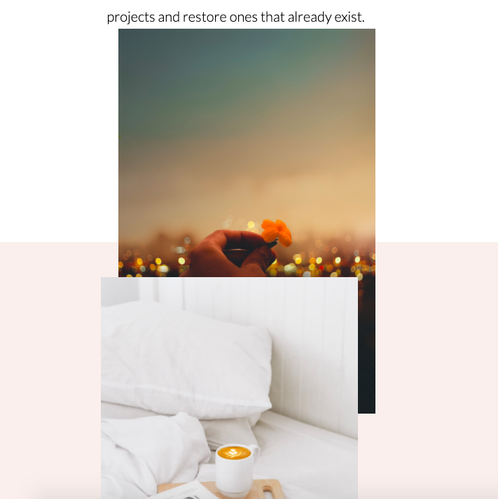
<img src="sunset-flower.jpg" max-width="800" height="550" />
</div>
</div>
</header>
<main>
<div class="section-1b-about"></div>
<div class="row section-2-about">
<div>
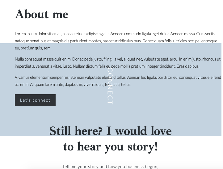
<img
src="bookpicture.png"
class="bookpicture"
max-width="800"
height="600"
/>
</div>
<div class="about-me">
<div><h1 class="about-me-title">About me</h1></div>
<div class="about-me-text">
Lorem ipsum dolor sit amet, consectetuer adipiscing elit. Aenean
commodo ligula eget dolor. Aenean massa. Cum sociis natoque
penatibus et magnis dis parturient montes, nascetur ridiculus
mus. Donec quam felis, ultricies nec, pellentesque eu, pretium
quis, sem.
<p>
Nulla consequat massa quis enim. Donec pede justo, fringilla
vel, aliquet nec, vulputate eget, arcu. In enim justo, rhoncus
ut, imperdiet a, venenatis vitae, justo. Nullam dictum felis
eu pede mollis pretium. Integer tincidunt. Cras dapibus.
</p>
Vivamus elementum semper nisi. Aenean vulputate eleifend tellus.
Aenean leo ligula, porttitor eu, consequat vitae, eleifend ac,
enim. Aliquam lorem ante, dapibus in, viverra quis, feugiat a,
tellus.
</div>
<div class="row inquire-about">
<a class="connect-button-about" href="./contact.html">Let's connect</a>
</div>
</div>
</div>
<div class="row section-3-about"></div>
<div class="row section-4-about">
<div class="column connect">
<div class="connect-title">
<h3>CONNECT</h3>
</div>
<div class="work-together">
Still here? I would love <br />
to hear you story!
</div>
<div class="connect-text">
Tell me your story and how you business begun, <br />
I would love to hear and help you achieve your goals.
</div>
<div class="row inquire">
<a class="connect-button" href="./contact.html">Get in touch</a>
</div>
</div>
</div>
</div>
<div class="row section-5-about"></div>
</main>
<footer class="footer">
<div class="row">
<div class="column">
<div class="logo-footer">
<h1>
ana <br />
joão
</h1>
</div>
</div>
<div class="column">
<div class="menu-footer">
<li><a class="transition" href="link">home</a></li>
<li><a class="transition" href="./about.html">about</a></li>
<li><a class="transition" href="link">work</a></li>
<li>
<a class="transition" href="./contact.html">contact</a>
</li>
<li><a class="transition" href="./shop.html">shop</a></li>
</div>
</div>
<div class="column">
<div class="social-media">
<ul>
<li><i class="fab fa-facebook-f"></i></li>
<li><i class="fab fa-instagram"></i></li>
<li><i class="fab fa-linkedin-in"></i></li>
</ul>
</div>
</div>
<div class="row rights">
<h3>Joana Oliveira© All Rights Reserved</h3>
</div>
</div>
</footer>
</div>
</body>
</html>
css
body {
  padding: 0;
}
* {
  padding: 0;
  box-sizing: border-box;
}

/*--------rows----------*/
.row {
  display: flex;
  flex-direction: row;
  flex-wrap: wrap;
  width: 100%;
}

/*-------columns-------*/
.column {
  display: flex;
  flex-direction: column;
  flex-basis: 100%;
  flex: 1;
}

/*--------------------HEADER---------------------*/

.header-container {
  width: 100%;
  height: 370px;
  flex-direction: row;
  background-color: rgba(234, 203, 193, 0.4);
  display: flex;
  margin: 0 auto;
  padding-bottom: 200px;
}

.logo {
  font-family: "Francois One", sans-serif;
  letter-spacing: 3px;
  padding-left: 80px;
}

.header {
  height: 280px;
  justify-content: space-between;
}
/* ------- nav --------- */

nav {
  height: 50px;
  flex-direction: row;
  justify-content: space-between;
  padding: 10px 50px 0 0;
}
nav ul {
  list-style: none;
  display: flex;
  padding: 5px;
}
nav li {
  margin-left: 45px;
  font-family: "Josefin Sans", sans-serif;
  display: list-item;
}

nav a {
  color: #343335;
  text-decoration: none;
  font-size: 16px;
  font-weight: 500;
  text-transform: uppercase;
}

/* ------- Containers --------- */

.wrap-container {
  flex-wrap: wrap;
  width: 100%;
  height: 100%;
}

.welcome-section {
  width: 400px;
}

.welcome-section h1 {
  font-family: "Ibarra Real Nova", serif;
  font-size: 50px;
}
.intro-text {
  font-family: "Lato", sans-serif;
  line-height: 1.8;
  letter-spacing: 0;
  font-weight: 300;
  font-size: 20px;
}

.work-together {
  font-family: "Ibarra Real Nova", serif;
  align-items: center;
  color: rgba(40, 44, 48, 1);
  font-weight: bold;
  text-align: center;
  justify-content: center;
  font-size: 40px;
  padding-top: 180px;
}

.connect-title {
  font-family: "Lato", sans-serif;
  color: white;
  line-height: 1.8;
  letter-spacing: 0.15em;
  text-align: center;
  justify-content: center;
  transform: rotate(90deg);
  font-size: 18px;
  font-weight: 700;
  padding-left: 200px;
}

.connect-text {
  font-family: "Lato", sans-serif;
  color: rgba(40, 44, 48, 1);
  font-size: 14px;
  padding: 30px 0 20px 0;
  text-align: center;
  line-height: 1.4;
  letter-spacing: 0.05em;
}
.inquire {
  justify-content: center;
}
.connect-button {
  font-family: "Lato", sans-serif;
  color: rgba(198, 211, 222, 1);
  text-align: center;
  letter-spacing: 0.15em;
  font-size: 13px;
  line-height: 1.4;
  text-decoration: none;
  cursor: pointer;
  background-color: rgb(48, 51, 54);
  padding: 10px 17px;
  justify-content: center;
  align-content: center;
  border-style: solid;
  border-radius: inherit;
}


/* ------- FOOTER --------- */

.footer {
  height: 250px;
  background-color: #3d3d3d;
}

.logo-footer h1 {
  font-family: "Francois One", sans-serif;
  letter-spacing: 3px;
  color: rgb(255, 255, 255);
  padding: 20px 0 0 0;
  text-align: center;
}

.menu-footer {
  flex-direction: column;
  padding-top: 50px;
}

.menu-footer ul {
  list-style: none;
  display: flex;
}
.menu-footer li {
  margin-left: 45px;
  font-family: "Josefin Sans", sans-serif;
  display: list-item;
  list-style-type: none;
  padding: 5px 0 5px 0;
}

.menu-footer a {
  color: rgb(255, 255, 255);
  text-decoration: none;
  font-size: 16px;
  font-weight: 500;
  text-transform: uppercase;
}

.social-media ul {
  list-style: none;
  display: flex;
  justify-content: center;
}

.social-media li {
  margin-left: 30px;
  display: list-item;
  list-style-type: none;
  padding: 40px 0 10px 0;
  color: rgb(255, 255, 255);
  font-size: 1.3rem;
}

.rights {
  padding-top: 30px;
  justify-content: center;
}
.rights h3 {
  font-family: "Lato", sans-serif;
  color: rgb(255, 255, 255);
  font-size: 10px;
  text-align: center;
  letter-spacing: 0.15em;
  line-height: 1.4;
}

/* ---------------- ABOUT PAGE---------------- */

.header-container-2 {
  width: 100%;
  height: 370px;
  background-color: rgba(221, 226, 220, 1);
  display: flex;
  padding-bottom: 100px;
}

.section-1-about {
  justify-content: space-around;
  padding-bottom: 100px;
}

.section-1b-about {
  height: 550px;
}

.section-2-about {
  height: 800px;
  justify-content: center;
  background-color: rgba(234, 203, 193, 0.3);
}

.bookpicture {
  padding: 50px 50px 0 0;
}

.about-me-title {
  font-family: "Ibarra Real Nova", serif;
  align-items: center;
  color: rgba(40, 44, 48, 1);
  font-weight: bold;
  text-align: left;
  font-size: 40px;
  padding: 250px 0 0 50px;
}

.about-me-text {
  width: 400px;
  padding-left: 50px;
  font-family: "Lato", sans-serif;
  line-height: 1.8;
  letter-spacing: 0;
  font-weight: 300;
  font-size: 13px;
}

.connect-button-about {
  font-family: "Lato", sans-serif;
  color: rgba(198, 211, 222, 1);
  text-align: center;
  letter-spacing: 0.15em;
  font-size: 13px;
  line-height: 1.4;
  text-decoration: none;
  cursor: pointer;
  background-color: rgb(48, 51, 54);
  padding: 10px 17px;
  border-width: 0px;
  border-style: solid;
  border-radius: inherit;
}

.section-3-about {
  height: 200px;
}

.section-4-about {
  background-color: rgba(198, 211, 222, 1);
  height: 300px;
}

.inquire-about {
  padding: 20px 0 0 50px;
}

.section-5-about {
  height: 300px;
}
https://codepen.io/joanaoli09/pen/YzXoEmm
Поскольку вы не сможете увидеть, как это выглядит из-за изображений, вот что это выглядит так: