<div class="index-section" data-section-id="{{ section.id }}">

  {% if section.settings.full_width %}<div class="gridlock-fluid"><div class="row">{% endif %}
  <div class="row homepage-section no-fouc">
    {% for block in section.blocks %}
    {% case block.settings.image_width %}
    {% when '25%' %}
    {%- assign image_size = '500x' -%}
    {%- assign image_width = 'desktop-3 tablet-fourth' -%}
    {% when '33%' %}
    {%- assign image_size = '500x' -%}
    {%- assign image_width = 'desktop-4 tablet-2' -%}
    {% when '50%' %}
    {%- assign image_size = '800x' -%}
    {%- assign image_width = 'desktop-6 tablet-3' -%}
    {% when '66%' %}
    {%- assign image_size = '1200x' -%}
    {%- assign image_width = 'desktop-8 tablet-two-thirds' -%}
    {% when '75%' %}
    {%- assign image_size = '1200x' -%}
    {%- assign image_width = 'desktop-9 tablet-three-quarter' -%}
    {% when '100%' %}
    {%- assign image_size = '1920x' -%}
    {%- assign image_width = 'desktop-12 tablet-6' -%}
    {% endcase %}

    {%- assign img_url = block.settings.image | img_url: image_size -%}
    <div class="homepage-promo {% if section.settings.full_width and block.settings[image_size] == '100%' %} centered{% endif %} {{ image_width }} mobile-3 promo-{{ block.id }}" {{ block.shopify_attributes }}>
      {% if block.settings.link != blank %}<a href="{{ block.settings.link }}">{% endif %}
        {% if block.settings.image != blank %}
        <img src="{{ img_url }}">
        {% else %}
        <div class="onboard">
          {{ 'image' | placeholder_svg_tag: 'placeholder-svg' }}
        </div>
        {% endif %}
        <div class="caption">
          {% if block.settings.title_text != blank %}
          <h3>{{ block.settings.title_text | escape }}</h3>
          {% endif %}
          {% if block.settings.hidden_text != blank %}
          <p>{{ block.settings.hidden_text | escape }}</p>
          {% endif %}
        </div>
      {% if block.settings.link != blank %}</a>{% endif %}
    </div>

    <style>
      .homepage-promo.promo-{{ block.id }} .caption h3 {
        color: {{ block.settings.promo_color }};
        font-size: {{ section.settings.promo_size }};
      }
      .homepage-promo.promo-{{ block.id }} .caption p {
        color: {{ block.settings.hidden_color }};
        font-size: {{ section.settings.hidden_size }};
      }
      #shopify-section-{{ section.id }} .homepage-promo .promo-inner h3 {
        font-size: {{ section.settings.promo_size }};
      }

      #shopify-section-{{ section.id }} .homepage-promo .promo-inner p {
        font-size: {{ section.settings.hidden_size }};
      }
    </style>

    <style>
      .promo-{{ block.id }} .promo-inner { float: none; }
    </style>

    {% endfor %}
  </div>
  {% if section.settings.full_width %}</div></div>{% endif %}

  {% if section.blocks.size == 0 %}
  {% include 'no-blocks' %}
  {% endif %}

</div>


<div class="clear"></div>

{% schema %}
{
    "name": "Image Gallery",
    "max_blocks": 6,
    "settings": [
      {
        "type": "checkbox",
        "id": "full_width",
        "label": "Enable full browser width",
        "default": false
      },
{
        "type": "select",
        "id": "promo_size",
        "label": "Promo image title size",
        "options": [
                    {
            "value": "12px",
            "label": "12px"
          },
          {
            "value": "13px",
            "label": "13px"
          },
          {
            "value": "14px",
            "label": "14px"
          },
          {
            "value": "16px",
            "label": "16px"
          },
          {
            "value": "18px",
            "label": "18px"
          },
          {
            "value": "20px",
            "label": "20px"
          },
          {
            "value": "24px",
            "label": "24px"
          },
          {
            "value": "28px",
            "label": "28px"
          },
          {
            "value": "32px",
            "label": "32px"
          },
          {
            "value": "36px",
            "label": "36px"
          }
        ]
      },
      {
        "type": "select",
        "id": "hidden_size",
        "label": "Promo image hover text size",
        "options": [
                    {
            "value": "12px",
            "label": "12px"
          },
          {
            "value": "13px",
            "label": "13px"
          },
          {
            "value": "14px",
            "label": "14px"
          },
          {
            "value": "16px",
            "label": "16px"
          },
          {
            "value": "18px",
            "label": "18px"
          },
          {
            "value": "20px",
            "label": "20px"
          },
          {
            "value": "24px",
            "label": "24px"
          },
          {
            "value": "28px",
            "label": "28px"
          },
          {
            "value": "32px",
            "label": "32px"
          },
          {
            "value": "36px",
            "label": "36px"
          }
        ]
      }
    ],
    "blocks": [
    {
      "type": "image",
      "name": "Image",
      "settings": [
        {
          "type": "select",
          "id": "image_width",
          "label": "Image width",
          "default": "33%",
          "options": [
            {
               "value":"25%",
               "label":"25%"
            },
            {
               "value":"33%",
               "label":"33%"
            },
            {
               "value":"50%",
               "label":"50%"
            },
            {
               "value":"66%",
               "label":"66%"
            },
            {
               "value":"75%",
               "label":"75%"
            },
            {
               "value":"100%",
               "label":"100%"
            }
          ]
        },
        {
          "type": "image_picker",
          "id": "image",
          "label": "Image"
        },
        {
          "type": "url",
          "id": "link",
          "label": "Link",
          "info": "Optional"
        },
       {
        "type": "text",
        "id": "title_text",
        "label": "Image title",
        "default": "Our collections"
       },
       {
        "type": "text",
        "id": "hidden_text",
        "label": "Shown on hover",
        "default": "Shop now"
       },
      {
        "type": "color",
        "id": "promo_color",
        "label": "Text color",
        "default": "#ffffff"
      },
      {
        "type": "color",
        "id": "hidden_color",
        "label": "Hover text color",
        "default": "#ffffff"
      }
      ]
    }
  ],
  "presets": [
    {
      "name": "Gallery",
      "category": "Image",
      "blocks": [
        {
          "type": "image"
        },
        {
          "type": "image"
        },
        {
          "type": "image"
        }
      ]
    }
  ]
  }
{% endschema %}
Это код раздела галереи изображений моего магазина Shopify. В настоящее время он имеет 4 изображения и показывает 4 столбца, 1 строку на рабочем столе, когда для изображений в галерее установлено значение 25%. Я доволен размером изображений на рабочем столе, однако при просмотре на мобильном устройстве изображения превращаются в 1 столбец, 4 строки. Как я могу сделать так, чтобы он отображал 2 столбца, 2 строки из 4 изображений и чтобы их размеры были меньше на мобильном устройстве?
Вот как изображения выглядят на мобильном телефоне: 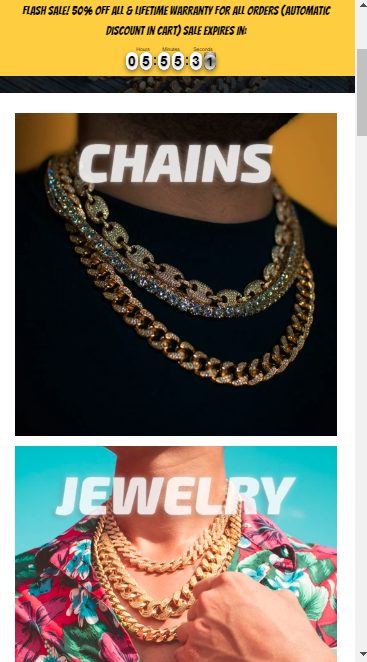
Вот так выглядят изображения на рабочем столе: 