вы можете использовать такие дроби
.container {
border: 1px solid black;
padding-bottom: 25%;
height: 100%;
width: auto;
display: grid;
grid-gap: 5px;
grid-template-columns: 1fr 1fr 1fr;
grid-template-rows: auto;
/* justify-content: center; */
justify-items: center;
align-items: center;
}
.container div {
width: 100px;
height: 100px;
}
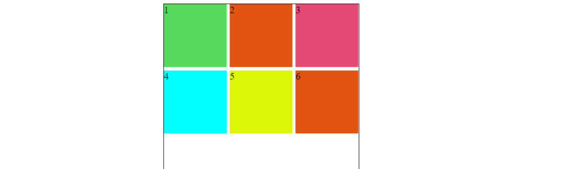
И результат будет как на картинке.
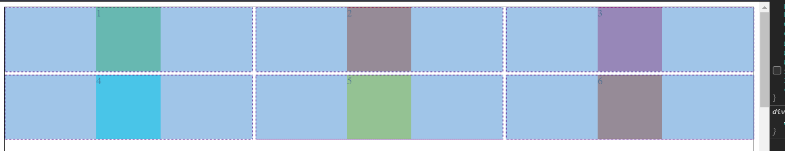
Если Если вам нужно более сгруппированное решение, вам нужно разместить контейнер, чтобы зафиксировать ширину и разместить контейнер по центру, или используйте гибкость.
ИЛИ форматируйте DIV
<div>
<div class="container">
  <div style="background-color: rgb(87, 217, 93);">1</div>
  <div style="background-color: rgb(227, 84, 18);">2</div>
  <div style="background-color: rgb(230, 73, 115);">3</div>
  <div style="background-color: rgb(0, 255, 255);">4</div>
  <div style="background-color: rgb(221, 245, 7);">5</div>
  <div style="background-color: rgb(227, 84, 18);">6</div>
</div>
</div>
Здесь:
div{
    margin: 0 auto;
    padding: 0;
    width: 100%;
}

.container {
    border: 1px solid black;
    padding-bottom: 25%;
    width: fit-content;
    display: grid;
    grid-gap: 5px;
  grid-template-columns: 1fr 1fr 1fr;
  grid-template-rows: auto;
    /* justify-content: center; */
    justify-items: center;
    align-items: center;
}

.container div {
    width: 100px;
    height: 100px;
}