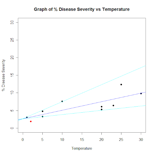
diseasesev<-c(1.9,3.1,3.3,4.8,5.3,6.1,6.4,7.6,9.8,12.4)

# Predictor variable, (Centigrade)
temperature<-c(2,1,5,5,20,20,23,10,30,25)

## For convenience, the data may be formatted into a dataframe
severity <- as.data.frame(cbind(diseasesev,temperature))

## Fit a linear model for the data and summarize the output from function lm()
severity.lm <- lm(diseasesev~temperature,data=severity)

line1 <- severity.lm$coefficients * c(1,2)
line2 <- severity.lm$coefficients * c(1,.5)

df <- as.data.frame(severity.lm[[12]])
df2 <- adply(df,1,function(x) cbind(line1[2]*x[[2]]+line1[1], line2[2]*x[[2]]+line2[1]))

plot(
  df2[df2[,1] >= min(df2[,c(3,4)]) & df2[,1] <= max(df2[,c(3,4)]),c(2,1)],
  xlab="Temperature",
  ylab="% Disease Severity",
  pch=16,
  pty="s",
  xlim=c(0,30),
  ylim=c(0,30)
)
title(main="Graph of % Disease Severity vs Temperature")
par(new=TRUE) # don't start a new plot
abline(severity.lm, col="blue")
abline(line1, col="cyan")
abline(line2, col="cyan")
points(df2[df2[,1] < min(df2[,c(3,4)]) | df2[,1] > max(df2[,c(3,4)]),c(2,1)], pch = 16, col = 'red')