Как сделать коробку со стрелкой в ​​CSS? - PullRequest
29 голосов
/ 07 августа 2011

Как сделать коробку со стрелкой в ​​CSS?

Сделать круглый угол легко. но любая идея сделать стрелку на левой стороне без использования изображения.

Возможно ли сделать это возможным с помощью

только один элемент <p>....</p>

body {
  background: #ff004e;
  padding: 40px
}
p {
  background: white;
  -webkit-border-radius: 10px;
  -moz-border-radius: 10px;
  border-radius: 10px;
  width: 250px;
  height: 150px
}
<p></p>

enter image description here

Ответы [ 7 ]

38 голосов
/ 07 августа 2011

Как это:

.arrow {
    border: solid 10px transparent;
    border-right-color: #FFF;
}

Демо: http://jsfiddle.net/sparkup/edjdxjf2/

ОБНОВЛЕНИЕ:

Это также может бытьдостигается без пустых элементов со свойством css :before

element:before {
    content: "";
    position: absolute;
    top: 50%;                         // half way down (vertical center).
    margin-top: -15px;                // adjust position, arrow has a height of 30px. 
    left:-30px;
    border: solid 15px transparent;
    border-right-color: #FFF;
    z-index: 1;
}

Демо : http://jsfiddle.net/sparkup/y89f1te0/

надеюсь, это поможет

13 голосов
/ 08 августа 2011

Крис Койер имеет превосходную сводку возможных форм, построенных в CSS с использованием одного элемента (и до / после): http://css -tricks.com / examples / ShapesOfCSS /

11 голосов
/ 22 февраля 2015

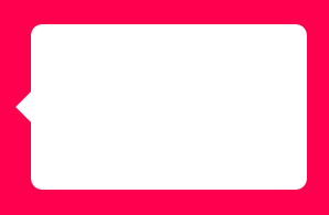
Стандартный всплывающая подсказка

Если вам нужна простая стрелка, вы можете добавить псевдоэлемент с помощью border-right.

body {
    background:#ff004e;
    padding:40px;
}
p {
    background:white;
    border-radius: 10px;
    width:250px;
    height:150px;
    position: relative;
    display: inline-block;
}
p:before {
    content:"";
    position: absolute;
    height: 0px;
    width: 0px;
    top: 60px;
    left: -29px; /* 1px buffer for zooming problems while rendering*/
    border-width: 15px;
    border-color: transparent white transparent transparent;
    border-style: solid;
}
<p></p>

FIDDLE 1

enter image description here

Наконечник с плоским краем

Если вы хотите плоский край для стрелки, попробуйте следующее:

body {
    background: #ff004e;
    padding:40px;
}
p {
    background:white;
    border-radius: 10px;
    width:250px;
    height:150px;
    position: relative;
    display: inline-block;
}
p:before {
    content:"";
    position: absolute;
    height: 45px;
    width: 16px; /* 1px buffer for zooming problems while rendering*/
    top: 50px;
    left: -15px; 
    background: white;
}
p:after {
    content:"";
    position: absolute;
    height: 40px;
    width: 15px;
    border-radius: 0 40px 40px 0;
    top: 75px;
    left: -15px;
    background: #ff004e;
    box-shadow: 0 -45px 0 0 #ff004e;
}
<p></p>

FIDDLE 2

enter image description here

3 голосов
/ 01 июня 2018

Используйте этот онлайн-инструмент, и вы можете сделать это, не набирая много кода

http://www.cssarrowplease.com

3 голосов
/ 14 января 2018

Мой ответ (без плоского края), добавлена ​​некоторая формула расчета:

.mainBox {
    border: solid 1px #e0e0e0;        
}

.mainBox:before {
    content:"";
    position: absolute;
    /*The right value must be calculated with: (top value of after) - (top value of before) = (right value of before) */
    /*example: (-4px) - (-7px) = 3px*/
    right: 72px; 
    /*The `top` value must be identical to border-width*/
    top: -7px; 
    width: 0;
    height: 0;
    border-style: solid;
    /*The `border-width` value must be identical to top*/
    border-width: 0 7px 7px 7px;
    /*The border color 3rd (#e0e0e0) value must be identical to its parent border color*/
    border-color: transparent transparent #e0e0e0 transparent;
    /*The (z-index of before) must at least one below the (z-index of after)*/
    /*Example: (z-index of before) < (z-index of after) or 9998 < 9999*/
    z-index:9998;
}

.mainBox:after {
    content:"";
    position: absolute;
    right: 75px;
    top: -4px; /*suppose to be identical to border-width*/
    width: 0;
    height: 0;
    border-style: solid;
    border-width: 0 4px 4px 4px;
    border-color: transparent transparent #fff transparent; 
    z-index:9999;
}

Основные правила:

  1. Правильное значение должно быть рассчитано с помощью: (after s top) - (before s top) = (before 'right)

пример: (-4px) - (-7px) = 3px

  1. Значение before и after top должно совпадать с border-width.

  2. 3-е значение цвета границы (в нашем примере # e0e0e0) должно быть идентично цвету родительской границы.

  3. before z-index должно быть как минимум на единицу ниже after z-index.

пример: (before s z-index) <(<code>after s z-index) или 9998 <9999. </p>

Результат:

enter image description here

0 голосов
/ 04 октября 2013
a.right{ border-style: dashed;
  border-color: transparent;
  border-width: 0.53em;
  display: -moz-inline-box;
  display: inline-block;
  font-size: 100px;
  height: 0;
  line-height: 0;
  position: relative;
  vertical-align: middle;
  width: 0; border-left-width: 1em;
  border-left-style: solid;
  border-left-color: #666;
  left: 0.25em; }

вышеуказанный код можно использовать для стрелки вправо.

0 голосов
/ 07 августа 2011

Вы можете использовать span, если не хотите использовать div.

span#pointer{border:solid 10px transparent;border-right-color:#fff;position:absolute;margin:-85px 0 0 -20px;}

http://jsfiddle.net/SSKwn/

...