К сожалению, я не нашел никаких вариантов или возможностей, предоставленных Flutter, для реализации раунда SnackBar.
Если вам действительно нужны / нужны закругленные углы и интервалы, вы можете скопировать исходный кодSnackBar и внесите изменения в копию.Не забудьте добавить implements SnackBar к определению вашего класса.
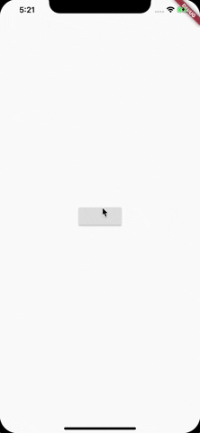
Я начал реализацию и добавил закругленные углы.Вам просто нужно добавить нижний отступ для телефонов, таких как iPhoneX, у которых есть элементы внизу, скрывающие вид.(Чтобы получить нижний интервал, вы можете использовать MediaQuery.of(context).viewInsets.bottom.)
Автономный пример, который вы можете скопировать:
main.dart
import 'package:flutter/material.dart';
import 'package:your_app_name/my_snack.dart';

void main() => runApp(MyApp());

class MyApp extends StatelessWidget {
  @override
  Widget build(BuildContext context) {
    return MaterialApp(
      home: Scaffold(
        body: MyBody()
      ),
    );
  }
}

class MyBody extends StatelessWidget {
  @override
  Widget build(BuildContext context) {
    return Center(
        child: RaisedButton(onPressed: () {
          Scaffold.of(context).showSnackBar(MySnack(content: Text('MySnack!')));
          }),
    );
  }
}
my_snack.dart
// Copyright 2015 The Chromium Authors. All rights reserved.
// Use of this source code is governed by a BSD-style license that can be
// found in the LICENSE file.

import 'package:flutter/rendering.dart';
import 'package:flutter/widgets.dart';
import 'package:flutter/material.dart';

const double _kSnackBarPadding = 24.0;
const double _kSingleLineVerticalPadding = 14.0;
const Color _kSnackBackground = Color(0xFF323232);

// TODO(ianh): We should check if the given text and actions are going to fit on
// one line or not, and if they are, use the single-line layout, and if not, use
// the multiline layout. See link above.

// TODO(ianh): Implement the Tablet version of snackbar if we're "on a tablet".

const Duration _kSnackBarTransitionDuration = Duration(milliseconds: 250);
const Duration _kSnackBarDisplayDuration = Duration(milliseconds: 4000);
const Curve _snackBarHeightCurve = Curves.fastOutSlowIn;
const Curve _snackBarFadeCurve = Interval(0.72, 1.0, curve: Curves.fastOutSlowIn);

/// Specify how a [SnackBar] was closed.
///
/// The [ScaffoldState.showSnackBar] function returns a
/// [ScaffoldFeatureController]. The value of the controller's closed property
/// is a Future that resolves to a SnackBarClosedReason. Applications that need
/// to know how a snackbar was closed can use this value.
///
/// Example:
///
/// ```dart
/// Scaffold.of(context).showSnackBar(
///   SnackBar( ... )
/// ).closed.then((SnackBarClosedReason reason) {
///    ...
/// });
/// ```

/// A button for a [SnackBar], known as an "action".
///
/// Snack bar actions are always enabled. If you want to disable a snack bar
/// action, simply don't include it in the snack bar.
///
/// Snack bar actions can only be pressed once. Subsequent presses are ignored.
///
/// See also:
///
///  * [SnackBar]
///  * <https://material.io/design/components/snackbars.html>

class _SnackBarActionState extends State<SnackBarAction> {
  bool _haveTriggeredAction = false;

  void _handlePressed() {
    if (_haveTriggeredAction)
      return;
    setState(() {
      _haveTriggeredAction = true;
    });
    widget.onPressed();
    Scaffold.of(context).hideCurrentSnackBar(reason: SnackBarClosedReason.action);
  }

  @override
  Widget build(BuildContext context) {
    return FlatButton(
      onPressed: _haveTriggeredAction ? null : _handlePressed,
      child: Text(widget.label),
      textColor: widget.textColor,
      disabledTextColor: widget.disabledTextColor,
    );
  }
}

/// A lightweight message with an optional action which briefly displays at the
/// bottom of the screen.
///
/// To display a snack bar, call `Scaffold.of(context).showSnackBar()`, passing
/// an instance of [SnackBar] that describes the message.
///
/// To control how long the [SnackBar] remains visible, specify a [duration].
///
/// A SnackBar with an action will not time out when TalkBack or VoiceOver are
/// enabled. This is controlled by [AccessibilityFeatures.accessibleNavigation].
///
/// See also:
///
///  * [Scaffold.of], to obtain the current [ScaffoldState], which manages the
///    display and animation of snack bars.
///  * [ScaffoldState.showSnackBar], which displays a [SnackBar].
///  * [ScaffoldState.removeCurrentSnackBar], which abruptly hides the currently
///    displayed snack bar, if any, and allows the next to be displayed.
///  * [SnackBarAction], which is used to specify an [action] button to show
///    on the snack bar.
///  * <https://material.io/design/components/snackbars.html>
class MySnack extends StatelessWidget implements SnackBar {
  /// Creates a snack bar.
  ///
  /// The [content] argument must be non-null.
  const MySnack({
    Key key,
    @required this.content,
    this.backgroundColor,
    this.action,
    this.duration = _kSnackBarDisplayDuration,
    this.animation,
  }) : assert(content != null),
        assert(duration != null),
        super(key: key);

  /// The primary content of the snack bar.
  ///
  /// Typically a [Text] widget.
  final Widget content;

  /// The Snackbar's background color. By default the color is dark grey.
  final Color backgroundColor;

  /// (optional) An action that the user can take based on the snack bar.
  ///
  /// For example, the snack bar might let the user undo the operation that
  /// prompted the snackbar. Snack bars can have at most one action.
  ///
  /// The action should not be "dismiss" or "cancel".
  final SnackBarAction action;

  /// The amount of time the snack bar should be displayed.
  ///
  /// Defaults to 4.0s.
  ///
  /// See also:
  ///
  ///  * [ScaffoldState.removeCurrentSnackBar], which abruptly hides the
  ///    currently displayed snack bar, if any, and allows the next to be
  ///    displayed.
  ///  * <https://material.io/design/components/snackbars.html>
  final Duration duration;

  /// The animation driving the entrance and exit of the snack bar.
  final Animation<double> animation;

  @override
  Widget build(BuildContext context) {
    final MediaQueryData mediaQueryData = MediaQuery.of(context);
    assert(animation != null);
    final ThemeData theme = Theme.of(context);
    final ThemeData darkTheme = ThemeData(
      brightness: Brightness.dark,
      accentColor: theme.accentColor,
      accentColorBrightness: theme.accentColorBrightness,
    );
    final List<Widget> children = <Widget>[
      const SizedBox(width: _kSnackBarPadding),
      Expanded(
        child: Container(
          padding: const EdgeInsets.symmetric(vertical: _kSingleLineVerticalPadding),
          child: DefaultTextStyle(
            style: darkTheme.textTheme.subhead,
            child: content,
          ),
        ),
      ),
    ];
    if (action != null) {
      children.add(ButtonTheme.bar(
        padding: const EdgeInsets.symmetric(horizontal: _kSnackBarPadding),
        textTheme: ButtonTextTheme.accent,
        child: action,
      ));
    } else {
      children.add(const SizedBox(width: _kSnackBarPadding));
    }
    final CurvedAnimation heightAnimation = CurvedAnimation(parent: animation, curve: _snackBarHeightCurve);
    final CurvedAnimation fadeAnimation = CurvedAnimation(parent: animation, curve: _snackBarFadeCurve, reverseCurve: const Threshold(0.0));
    Widget snackbar = SafeArea(
      bottom: false,
      top: false,
      child: Row(
        children: children,
        crossAxisAlignment: CrossAxisAlignment.center,
      ),
    );
    snackbar = Semantics(
      container: true,
      liveRegion: true,
      onDismiss: () {
        Scaffold.of(context).removeCurrentSnackBar(reason: SnackBarClosedReason.dismiss);
      },
      child: Dismissible(
        key: const Key('dismissible'),
        direction: DismissDirection.down,
        resizeDuration: null,
        onDismissed: (DismissDirection direction) {
          Scaffold.of(context).removeCurrentSnackBar(reason: SnackBarClosedReason.swipe);
        },
        child: Padding(
          padding: const EdgeInsets.all(8.0),
          child: Container(
            decoration: BoxDecoration(
              color: backgroundColor ?? _kSnackBackground,
              borderRadius: BorderRadius.circular(8.0)
            ),
            child: Material(
              elevation: 6.0,
              color: Colors.transparent,
              child: Theme(
                data: darkTheme,
                child: mediaQueryData.accessibleNavigation ? snackbar : FadeTransition(
                  opacity: fadeAnimation,
                  child: snackbar,
                ),
              ),
            ),
          ),
        ),
      ),
    );
    return ClipRect(
      child: mediaQueryData.accessibleNavigation ? snackbar : AnimatedBuilder(
        animation: heightAnimation,
        builder: (BuildContext context, Widget child) {
          return Align(
            alignment: AlignmentDirectional.topStart,
            heightFactor: heightAnimation.value,
            child: child,
          );
        },
        child: snackbar,
      ),
    );
  }

  // API for Scaffold.addSnackBar():

  /// Creates an animation controller useful for driving a snack bar's entrance and exit animation.
  static AnimationController createAnimationController({ @required TickerProvider vsync }) {
    return AnimationController(
      duration: _kSnackBarTransitionDuration,
      debugLabel: 'SnackBar',
      vsync: vsync,
    );
  }

  /// Creates a copy of this snack bar but with the animation replaced with the given animation.
  ///
  /// If the original snack bar lacks a key, the newly created snack bar will
  /// use the given fallback key.
  SnackBar withAnimation(Animation<double> newAnimation, { Key fallbackKey }) {
    return MySnack(
      key: key ?? fallbackKey,
      content: content,
      backgroundColor: backgroundColor,
      action: action,
      duration: duration,
      animation: newAnimation,
    );
  }
}
Изменения, внесенные в SnackBar:
- Переименовано
SnackBar в MySnack - Добавлено
implements SnackBar в MySnack класс - Установить
bottom: false внутри SafeAreaв MySnack метод построения - Добавлен
Container вокруг Material, который является фоном SnackBar - Перемещено объявление
color из Material в созданноеContainer - Добавлены нужные
borderRadius (вместе с color) в виде BoxDecoration к Container