Пожалуйста, помогите мне,
Я использую bootstrap-4 и настраиваю дизайн, но проблема в том, что мой box-inner div работает нормально на рабочем столе со всеми div одинаковой высоты, когда я ввожу больший или маленький текст, но реальный ipad не является полной высотой того же столбца, у меня есть скриншот вложения о выводе на рабочий стол и реальном выводе ipad, помогите, пожалуйста, почему бы не высоту всех столбцов в реальном ipad.
Скрин-шот рабочего стола : 
Скриншот реального вывода ipad : 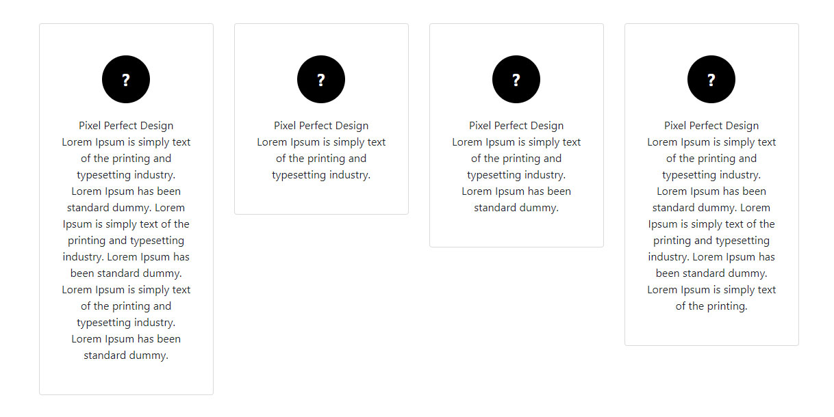
.features-box-style {
                padding: 100px 0;
            }
            .features-box-style .box-inner {
                border: 1px solid #dbdbdb;
                border-radius: 4px;
                padding-top: 18%;
                padding-bottom: 18%;
                text-align: center;
                height: 100%;
            }
            .features-box-style .box-inner .icon {
                width: 70px;
                height: 70px;
                display: inline-block;
                background-color: #000;
                color: #fff;
                border-radius: 100%;
                text-align: center;
                line-height: 70px;
                font-size: 25px;
                font-weight: bold;
                margin-bottom: 20px;
            }
            .features-box-style .box-inner .content {
                width: 75%;
                margin: 0 auto;
            }
<link rel="stylesheet" href="https://maxcdn.bootstrapcdn.com/bootstrap/4.0.0/css/bootstrap.min.css" integrity="sha384-Gn5384xqQ1aoWXA+058RXPxPg6fy4IWvTNh0E263XmFcJlSAwiGgFAW/dAiS6JXm" crossorigin="anonymous">

<section class="features-box-style">
            <div class="container">
                <div class="row">
                    <div class="col-12 col-lg-3 col-md-6 box">
                        <div class="box-inner">
                            <div class="icon">?</div>
                            <div class="small-title">Pixel Perfect Design</div>
                            <p class="content">Lorem Ipsum is simply text of the printing and typesetting industry. Lorem Ipsum has been standard dummy. Lorem Ipsum is simply text of the printing and typesetting industry. Lorem Ipsum has been standard dummy. Lorem Ipsum is simply text of the printing and typesetting industry. Lorem Ipsum has been standard dummy.</p>
                        </div>
                    </div>
                    <div class="col-12 col-lg-3 col-md-6 box">
                        <div class="box-inner">
                            <div class="icon">?</div>
                            <div class="small-title">Pixel Perfect Design</div>
                            <p class="content">Lorem Ipsum is simply text of the printing and typesetting industry. </p>
                        </div>
                    </div>
                    <div class="col-12 col-lg-3 col-md-6 box">
                        <div class="box-inner">
                            <div class="icon">?</div>
                            <div class="small-title">Pixel Perfect Design</div>
                            <p class="content">Lorem Ipsum is simply text of the printing and typesetting industry. Lorem Ipsum has been standard dummy.</p>
                        </div>
                    </div>
                    <div class="col-12 col-lg-3 col-md-6 box">
                        <div class="box-inner">
                            <div class="icon">?</div>
                            <div class="small-title">Pixel Perfect Design</div>
                            <p class="content">Lorem Ipsum is simply text of the printing and typesetting industry. Lorem Ipsum has been standard dummy. Lorem Ipsum is simply text of the printing and typesetting industry. Lorem Ipsum has been standard dummy. Lorem Ipsum is simply text of the printing.</p>
                        </div>
                    </div>
                </div>
            </div>
        </section>