CSS: Отображение: встроенный блок; - PullRequest
1 голос
/ 16 марта 2019

У меня проблема.Я должен сделать это.
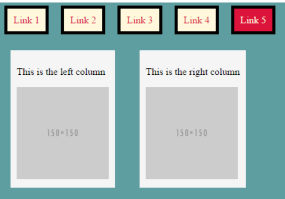
1

но я получаю это

2

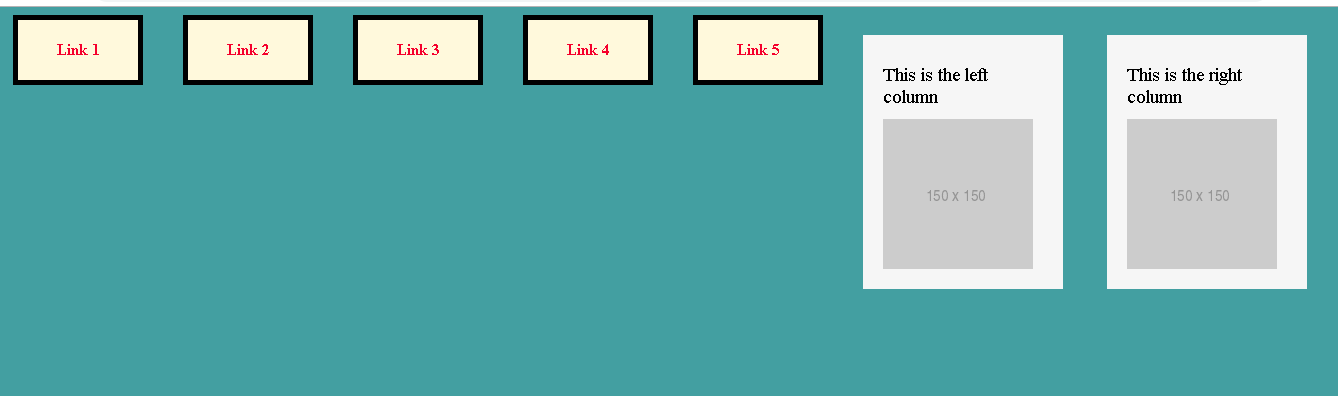
Я думаю, что мне нужно где-то отключить: display: inline-block но во всех местах, которые я пробовал, это не такРабота?Кто-нибудь знает, как сделать их один за другим?Первые поля - меню, вторые таблицы.То есть я должен поставить таблицу под меню.Но как?

body {
  
}

.menu {
  list-style-type: none;
  margin: 0px;
  padding: 0px;
}

.menu-item {
  background: cornsilk;
  color: crimson;
  margin-left: 20px;
  margin-right: 20px;
  text-align: center;
  float: left;
  border-style: solid;
  border-width: 5px;
  border-color: black;
}

.menu-item a {
  text-decoration: none;
  color: crimson;
  font-weight: bold;
  padding: 20px;
  width: 80px;
  display: inline-block;
}

.menu-item a:hover {
  background: crimson;
  color: cornsilk;
}

section {
  display: inline-block;
}

article {
  width: 160px;
  background: whitesmoke;
  padding: 20px;
  margin: 20px;
  display: inline-block;
  vertical-align: top;
  float: left;
}

aside {
  width: 160px;
  display: inline-block;
  vertical-align: top;
  background: whitesmoke;
  float: left;
  padding: 20px;
  margin: 20px;
}

.text {
  margin-top: 10px;
  font-size: 19px;
  margin-bottom: 10px;
  background: whitesmoke;
}
<body bgcolor="cadetblue">
<nav>
  <ul class="menu">
    <li class="menu-item">
      <a href="#"> Link 1 </a>
    </li>
    <li class="menu-item">
      <a href="#"> Link 2 </a>
    </li>
    <li class="menu-item">
      <a href="#"> Link 3 </a>
    </li>
    <li class="menu-item">
      <a href="#"> Link 4 </a>
    </li>
    <li class="menu-item">
      <a href="#"> Link 5 </a>
    </li>
  </ul>
</nav>
<section>
  <article>
    <div class="text"> This is the left column </div>
    <img src="http://placehold.it/150x150">
  </article>
</section>
<section>
  <aside>
    <div class="text"> This is the right column </div>
    <img src="http://placehold.it/150x150">
  </aside>
</section>
</body>

1 Ответ

0 голосов
/ 16 марта 2019

Вы можете использовать clear: both для menu::after, чтобы переместить элементы после него вниз, например:

body {
  
}

.menu {
  list-style-type: none;
  margin: 0px;
  padding: 0px;
}

.menu::after {
  content: "";
  display: table;
  clear: both;
}

.menu-item {
  background: cornsilk;
  color: crimson;
  margin-left: 20px;
  margin-right: 20px;
  text-align: center;
  float: left;
  border-style: solid;
  border-width: 5px;
  border-color: black;
}

.menu-item a {
  text-decoration: none;
  color: crimson;
  font-weight: bold;
  padding: 20px;
  width: 80px;
  display: inline-block;
}

.menu-item a:hover {
  background: crimson;
  color: cornsilk;
}

section {
  display: inline-block;
}

article {
  width: 160px;
  background: whitesmoke;
  padding: 20px;
  margin: 20px;
  display: inline-block;
  vertical-align: top;
  float: left;
}

aside {
  width: 160px;
  display: inline-block;
  vertical-align: top;
  background: whitesmoke;
  float: left;
  padding: 20px;
  margin: 20px;
}

.text {
  margin-top: 10px;
  font-size: 19px;
  margin-bottom: 10px;
  background: whitesmoke;
}
<body bgcolor="cadetblue">
<nav>
  <ul class="menu">
    <li class="menu-item">
      <a href="#"> Link 1 </a>
    </li>
    <li class="menu-item">
      <a href="#"> Link 2 </a>
    </li>
    <li class="menu-item">
      <a href="#"> Link 3 </a>
    </li>
    <li class="menu-item">
      <a href="#"> Link 4 </a>
    </li>
    <li class="menu-item">
      <a href="#"> Link 5 </a>
    </li>
  </ul>
</nav>
<section>
  <article>
    <div class="text"> This is the left column </div>
    <img src="http://placehold.it/150x150">
  </article>
</section>
<section>
  <aside>
    <div class="text"> This is the right column </div>
    <img src="http://placehold.it/150x150">
  </aside>
</section>
</body>
...